Found Fortune Card Deck
- Valentina Chirkes
- Oct 11, 2021
- 4 min read
Updated: Jul 31, 2024
This project is part of the Parsons "Integrative Studio 1" class that is part of the first-year curriculum.


For this project, we had to create a deck of 52 cards inspired by different words. We selected the words before knowing what the assignment was about. There are words I would use to describe myself, some related to my academic and career future, issues or problems that concern me, others that describe a scene we saw, my first pet, my favorite place, the last time I cried, and the last time I laughed. The prompts to choose the words made most of them very personal and unique to each one of us. Choosing the words blindly made creating the design for each one of them more challenging.
For my deck of cards, I was inspired by found poetry, which is a type of poetry created by taking words and phrases from pre-written pages and giving them new meanings. This type of writing joins words, art, and creativity. I used to do this as a creative exercise in my Literature class in high school. In found poetry, the page from which the new poem is created is as important as the final product. I chose to use a Spanish-English dictionary as it represents the back and forth translation between both languages that my brain experiences every day. Each card is made from the page of the dictionary which contains the card's word in Spanish. Given that lots of my words were related to the environment and sustainability, it was important for me to create as little waste as possible with this project, so I bought a used book, recycled all the scraps of paper I didn't use and kept the rest of the book for future projects.


List of words used for the deck of cards

Once I had chosen an idea for my cards, it was important that I created a workflow as there were lots of cards with many parts each. Because there was only one of each word in the dictionary, doing the design on the actual book page was the last step of my process. I started by sketching all of the cards in my journal and finding the most appropriate translations to use. Each card had two layers: the back design and the book page. Because of how thin the book pages were, the back design had to be printed on sturdy paper. I created a design using Adobe Illustrator. I decided to use books as a theme for my cards and used a bookcase as inspiration for the back design. The design is the same whether you have the card right-side up or upside down. The color is the same light blue used in the flag of Argentina, which I chose because this project started becoming very personal.

Before I started working on the real pages, I tried different drawing media on some random book pages. Initially, I wanted to find the letters within the text without making any cutouts but then I realized that it was very difficult to understand. The layout I selected is the one on the right-most card in the photo above. I tried using alcohol-based markers and color pencils but neither of them produced the final design that I wanted. I ended up going with black and white cards because I liked the subtle look of the illustrations. Once I had the backs printed out, the designs made and I had chosen the drawing medium, I started getting to work on each card. This part was the most time-consuming and sometimes tedious. I cut out each letter and drew on the design with a fine tip marker. I had some more graphic designs and some that were most conceptual. My favorite was the one for the word "textile", in which I wove the page simulating threads in a textile.

After many hours of cutting and gluing, I had the final deck of cards. I am completely satisfied with how they turned out as they are exactly what I envisioned. I like that they are cohesive but each one follows a different idea. Some of the illustrations are more literal or iconographic while some are more abstract and conceptual. I included the cutouts of the words in the designs as well as some other cutouts. Not using color was something challenging at some points, like for the card with the word "green". This challenged me to think of how I can illustrate a color without actually using it. I ended up drawing an evergreen tree, which is something that is always green and widely known.


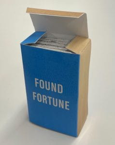

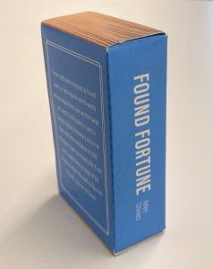
The card's packaging
The final step of the project was to design and make the box. I made a design in Adobe Illustrator and printed it out on thick paper. The box has the same shape as a traditional box of cards but the design, when folded, simulates a book. It has a cover, spine, and back cover. This last part of the process gave it a complete look and really turned it into a set of cards. It was very fun to give each other tarot card readings in class using our own sets.
コメント