Mark-making Exploration
- Valentina Chirkes
- Sep 7, 2021
- 3 min read
This project is part of the Parsons "Drawing & Imaging" class that is part of the first-year curriculum.
In this project, we explored different methods and techniques for black and white mark-making. In my case, I tried various drawing media on white paper and experimented with both abstract shapes and patterns and more graphic ones. Further on, we analyzed the relationship between this type of illustration and certain words and the effect value can have on them.


For the first part of this project, we explored different patterns and materials. For the small ones, I used ink, pencil, charcoal, marker, microfiber pens, and crayons as well as some accessories such as glue, forks, blending tools, and paper towels to further expand the capacities of each material. I used the larger grids to explore even more the patterns that I had found the most interesting. What I found the most captivating of this exercise was seeing how different media behave on their own and with each other. As shown in the images, I was particularly interested in seeing how each media would create a gradient. Some, such as charcoal and pencil, were easier to blend whereas others, like in and marker, were much harder. The most difficult part of this exercise was keeping some of the illustrations in a confined square while at the same time trying to achieve the desired look.

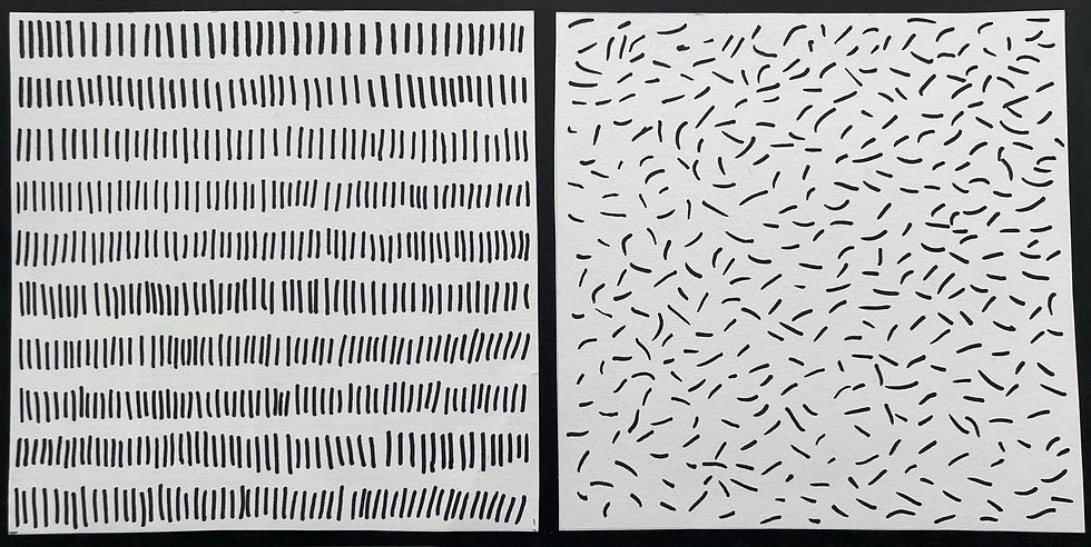
In the second part of this project, we explored how two opposite words can be represented in drawings. For the first pair, I chose "Geometric" and "Organic". In this case, I chose the medium that was best described by each word. Markers tend to create more clean and geometric shapes while ink has a more fluid and organic aspect.
For the second pair, I chose the words "Static" and "Kinetic". This time I only used markers as I wanted to show how the same 'object' can be represented in two opposite ways.

The last word pair I chose was "Apart" and "together". For this one, I had many trials and errors but I finally decided on these two illustrations which remind me of metal particles being attracted together by a magnet in the center of the page. Overall, the word pairs part of the project helped me understand how by selecting the correct medium and shapes one can transmit a feeling through a simple pattern.


The last part of the project was creating two scales, one which represented value and one which showed any sort of progression. For the value scale, I used compressed charcoal to create a linear pattern. Each part of this scale increased in pressure and in the proximity and abstraction of the lines, which altogether formed a darker pattern each time. With charcoal, it was very difficult for me to maintain a certain line width throughout the whole rectangle so I had to incorporate that irregularity into my scale. For the progression scale, I chose to do a pattern based on repetition. I used ink which allowed me to explore the shape, value, and transparency of each part of the gradient. I wanted each rectangle to have one more circle than the previous one and create a sense of addition. In order to do this, I had to create the most similar drawings possible, which was the biggest challenge because of the medium I chose.
Each part of this project allowed me to see how different media behave on their own and in relation to each other. It showed me how every part of a drawing plays a role in the final effect of it, from the paper all the way to the fixative. Most of all, this project revealed the possibilities each drawing material has as I often found myself thinking that there were no more pattern options for a certain material but I eventually found many more. The most challenging part was when a material did not behave the way I intended it to. However, this made me learn different techniques and methods to achieve what I desired in another way or by finding the correct medium.
Comments